| | Published November 20th, 2013
| The Home Designer Color Your World
| | By Brandon Neff | 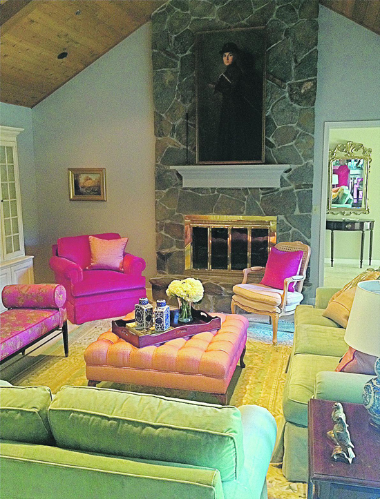 | | Walls were painted a custom grey to accent the grand fireplace stone. Photos courtesy Brandon Neff Design
|
Have you ever entered a room and instantly felt your spirit lifted? Or, driven past a field of flowers and been transported? That's the power of color. Sure, we all have different preferences when it comes to color - some cooler, some warm and enveloping. Many studies have been done on the psychology of the way color impacts us, but the bottom line is we like what we like. Color is visceral - it transforms.
 For my client, Connie, it was all about saturated hues reminiscent of a spring bouquet - cerise, raspberry, coral, peony and leaf. She hadn't updated her home in many years and was ready for something transformational.
For her home in Moraga, Connie wanted her space to speak to her love of happy, candy colored accents and soft fabrics blended to create an altogether glamorous effect. Strong colors take a confident hand and not a small amount of courage to pull off successfully. But, oh, what a payoff! What I hope we achieved in her home is an expression of her warm and inviting personality mixed with her traditional and sophisticated heritage.
For starters, there were several great elements in her living room - high ceiling, sundrenched light from the patio doors leading to the pool and a grand fireplace that climbed the height of the space. While the room had potential, it felt washed out. Her pastel fabrics and white walls were overwhelmed by the strong California light - a light that needs stronger color to stand up to.
When I suggested turning up the volume on their palette, and adding a range of patterns, she and her husband came on board - enthusiastically.
Adding color to your life, and design, doesn't mean splashing it everywhere - especially in a room that needs to work cohesively with adjacent spaces. With a kitchen on one end, and the entry flanking the other, it was important to link the spaces in my client's home while still achieving something beautiful and fresh. Think of the walls as the shell that can be a neutral, but highlighted backdrop for enhancing everything you put in that room - and a landscape to highlight the art you hang.
With that in mind, I suggested a warm grey for the walls that helped pop the crisp white mouldings and accent the wood planked ceiling. Grey is a fantastic foil that works in any room to add depth to your walls while accenting nearly every other accent color. Grey and chartreuse, grey and yellow and grey with coral are a few of my favorites. Grey keeps more intense hues from looking too garish - grey adds a subtle sophistication.
The mantel was painted a deeper shade of grey to pull out the field stones that clad the fireplace breast - the original light oak mantel looked dated and out of place. It wasn't a particularly interesting feature, but by painting it out it became more a part of the room. Remember, painting wood isn't a sacrilege unless the piece is a treasured antique or somehow integral to your home. A coat of paint has brought many a vintage chair or dresser back to life.
At nearly 20 feet by 15 feet, the room had enough scale to handle heartier pieces - always keep proportion in mind when designing any space - as small pieces in a large room feel like doll furniture. My clients wanted the space to work for both cozy TV watching and for entertaining larger groups. Having several areas within the space for lounging, reading and conversation divided the room into "zones" that allowed it to work on many levels. I introduced them to a bench with gracious bolsters that serves to flank the oversized ottoman I designed, while adding seating and allows informal gathering around the center of the room. Its brass capped legs and mid-century lines worked beautifully with more traditional elements.
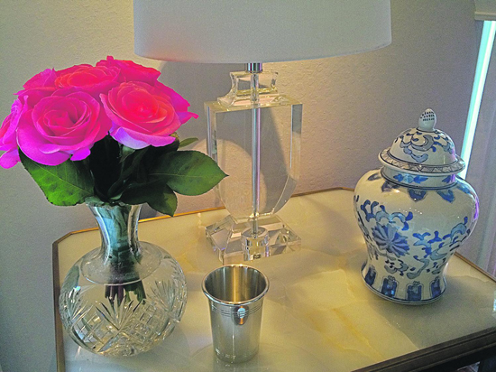
A classic club chair in the corner upholstered in a rich watermelon mohair provides a place to read and enjoy the view to the pool, and a vintage Queen Anne chair can migrate to serve as needed while adding a traditional silhouette. From the onyx side tables to the velvet pillows, every piece added layers of color, texture, pattern and warmth.
Draperies were kept simple and elegant with a tailored valance. Table lamps in Grecian urn shapes made of glass mix with a blue and white chinoiserie task lamp for added interest and to keep everything from looking too predictable.
Tips of the trade:
In a room with two large upholstered and skirted pieces (in this case the sofa and loveseat), try adding leggy accents like the ottoman with cabriole legs and the single armchair - this helps to keep the room from looking too "heavy." Try and keep your wood finishes to fewer than three in any room - we mixed deep walnut, lighter oak and a large painted media cabinet to hold her beloved Vermont pottery to full effect without it looking like a tag sale - think about continuity in every detail.
Don't be afraid to mix metals. Layering brass, silver, and even chrome can add interest and keep everything from looking too staged.
You don't need to match your art to your room. Fewer things in design can drive me over the edge more than when I see homeowners match the art colors to their furnishings and fabrics. It reminds me of a Starbucks where the quaint coffee posters pick up every tone and hue of the flooring, walls and banquette seating. You home isn't a corporate logo, so stop matching! The eye needs to travel, and a room needs visual tension to keep it interesting. Mix it up. Vary the lighting. I've said this before, but it deserves repeating. Every room needs three kinds of lighting: general light (recessed cans), accent lighting (to highlight art or a specific view) and task lighting (for reading and to keep light at eye level where it's more flattering on the face.)
And please, everything on dimmers. Your guests will thank you.
|
 | | Groupings like this onyx table, Chinese lidded jar and coral colored roses give high impact style to a corner of the room.
| 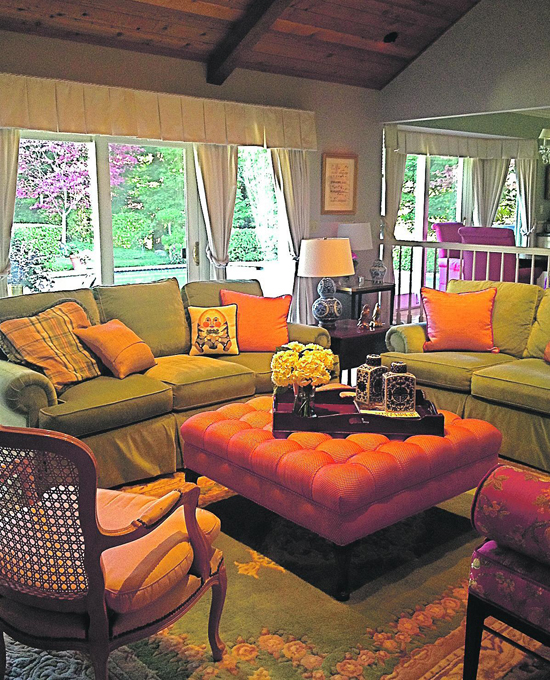 | | An oversized ottoman does double duty as a place for snacks and extra seating in a pinch.
|  | |
Brandon Neff is a Bay Area based
Interior Designer.
He can be reached at
BrandonNeffDesign.com or at brandonneffdesign@yahoo.com.
| | | | | | | | | |
| | | print story
Before you print this article, please remember that it will remain in our archive for you to visit anytime.
download pdf
(use the pdf document for best printing results!) | | | Comments | | |
| | | | | | | | | | | | | | | | |

