|
|
|
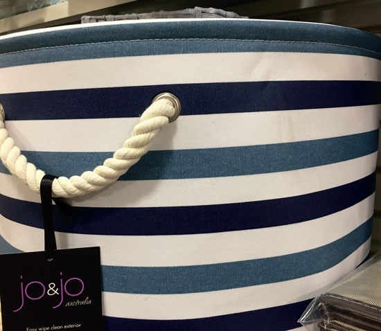
Blues and whites are a cooling combination for summer.
|
|
|
|
|
|
Welcome to summer, Lamorinda! It's time to declutter and cool down our interior spaces. This month, I wanted to share a favorite summer combination for accessories, pillows and updates: the beloved blue and white.
 For Stylish Suburbanites across our beloved community, this color combination refreshes and sets the stage for easy summer living. I like this color palette. In design circles, blue and white is considered a neutral. You can accessorize with any color, from reds over the Fourth of July to oranges, purples and yes, even blacks and browns. One key to using this color combination well, is to "know thy style," and integrate new pieces in similar ways. Because this is a quick summer update, don't try to redo your entire home. Is your home space contemporary? Then use simple, graphic and textural pieces. Here I share some easy tips for using blue and white, which is a readily affordable update for any décor style.
The Contemporary: If you have small children, on a limited budget or are decorating for a resale soon, this is the way to go. Don't over-do, with either pattern or quantity. I love the strong surge in clean lines and contemporary styles, and we see, as homes are staged for sale this summer, that contemporary lines are de rigueur. How do you incorporate blue and white when your space is decluttered and your eye craves no distraction? Use the grey tones, classic seersucker in pillows and stay away from too much floral.
The Luxury Chic Classic: I think this is my personal favorite. It's easy to live with and doesn't require a perfect placement for every piece 24/7. You can fill book cases with blue and white ginger jars, fresh florals and upholstered or wallpapered backs on shelves, which makes this style all about abundance. Tips to achieve this look include: varying heights, mixing both traditional patterned blue and white, as well as contemporary styles and accenting with beiges and whites, which adds depth.
In this combination, it is absolutely okay to mix the hues of blue. In fact, the mixture is what keeps these displays more designer than department store. We are seeing a resurgence of this style in the bespoke market, which tends to run ahead of high-end retail in design by about four to five years, and budget retail by five to six years. We are creating interiors featuring a return to family, community, abundance, comfort, luxurious deep and soft upholstery, and decidedly away from the monochromatic, wood-clad contemporary look.
The Transitional Traditional: Think of this look as the halfway point between contemporary and luxury chic or bespoke. One key to achieving this look is to vary the materials, but pull back a bit on quantity from the Luxury Chic approach. Look closely at the marriage of materials, and consider adding wood or metal to the mix, especially in the use of interesting accessories.
Add books as well. We most often use this combination in family room book shelves that get a lot of use and love. A great place to start if you are craving this look is to head out to local restaurants and stores on a photo survey. Take note of how many materials are used in a particular display and work to duplicate that in your own home. It's easy to add to the mix, by purchasing accessories at thrift shops and old book stores, where the distressing is part of the package.
A key to all of this working is to budget your time so the summer blue and whites take less than one weekend to complete. Our goal is to live well and enjoy our spaces, while making quick updates without breaking the bank.
Enjoy your summer, and if you'd like us to help you redesign your spaces or you are interested in attending a Design Workshop - yes, it's time again to register for our Stress Free Holiday Home workshop, as we go shopping at market in August - let me know with an email: ann@couturechateau.com. We sell out every single year. If you'd like to DIY your holiday home, you can purchase my course at www.stressfreeholidayhome.com.
|