|
|
Published September 24th, 2014
|
Stylish Solutions
|
| Natural Fall Decor |
| By Ann McDonald |
 |
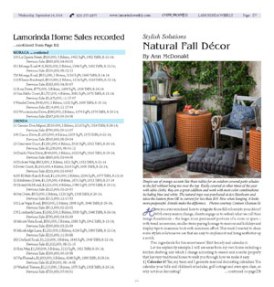
| Simple use of orange accents like these tables for an outdoor covered patio alludes to the fall without being too over the top. Easily covered at other times of the year with table cloths, they are a great addition and work with most color combinations including blue and white. The natural rope was purchased at Ace Hardware and takes the lantern from OK to current for less than $10. Now when hanging, it looks more purposeful. Details make the difference. Photos courtesy Couture Chateau llc |
Have you ever wondered how to integrate those fall colors into your décor? With every season change, clients engage us to refresh what we call their design foundations - the larger more permanent portions of a room or space - with trend accessories, smaller items paying homage to seasons and holidays and display tips to maximize look with minimum effort. This week I wanted to share some stylish solutions we use that are easy to implement and bring aesthetics up a notch.
 Two ingredients for this secret sauce? Edit fiercely and calendar it.
Let me explain by example. I will use areas from my own home including a kitchen shelving unit which I change according to season and a rental property that has very traditional bones to walk you through how we make it easy.
1) Calendar it! Yes, my team and I generate seasonal decorating calendars. You calendar your bills and children's schedules, golf outings and even spin class, so why not your decorating? By getting practical, we can budget and rotate accessories. It doesn't have to be over the top, but I always tell clients if you have waited until November to think about holiday décor, you will overspend by at least 25 percent and "under wow" by the same amount.
We use two systems: Google Calendar and icalendar, both of which will sync with your cell phones. I love getting the reminder in September that my clients' holiday color selections are due so I can pre-order ribbon at discount prices in bulk. It's fun to be ahead of the game. It also keeps clients from overspending on whims when swayed by displays at loca-l home stores.
The calendar forces order. Since we are in the fall right now I will give you a pass for this year, but I suggest at least six weeks prior to a decorative seasonal change for best planning. This way you can take advantage of online sales, no rush shipping and plan for storage so the items can be used again in some form next year.
To boot? Your Pinterest app will be a source of fun, not stress! No last minute glue guns or rushing to the craft store for one more pumpkin.
2) Find a thread, sometimes literally! In my kitchen shelving example, to keep from taking the space too over the top for fall, I chose to focus on the color cream. As the background of the antique tile which served as one of our inspirations for the overall design, I focused on finding vessels and pots that were simple and similarly colored. Many would have picked up on the orange to tie it into the fall holidays but sometimes the "theme" color is just too much. I didn't want it to look kitschy, I wanted it to look elegant and un-rehearsed, more natural, less contrived.
Because it is still warm in California most falls I use simple greenery instead of bunches of flowers or dried hay stalks. There is a place for those to be sure, but on my every day open shelving the food items are enough to provide the same type of visual without being over the top.
3) Work in threes: three colors, three textures, three types. If you look at the shelves, this fall even though brass and rose gold are everywhere, I still love the patina of unpolished silver. It's elegant without being fussy. It's also easily sourced from thrift or antique stores at relatively inexpensive prices. My team and I literally removed every item off the shelves, dusted well and then started editing fiercely with our three-fold focus for fall: silver, natural woven materials and cream pottery. I calendared, budgeted and purchased several pottery items online and had them shipped to the house so there were several to choose from without traipsing from shop to shop (which I have admittedly done before).
The baskets store napkins, tableware and other sundries used often which are not quite pretty enough to display openly. Even my sons and husband know to close the basket lids when putting or clearing items away, making the no fuss look relatively easy to maintain.
This is where edit fiercely comes to play. Be brutal. The difference between a "wow" space and mediocre one is the edit. Leave room for life and people (the real décor in a space) and space for your eyes to rest, especially on open shelving. I give a pass to library book shelves but in your kitchen or family room, the less is more look drastically brings up any aesthetic.
Just like jewelry, consider removing one accessory before you call it complete!
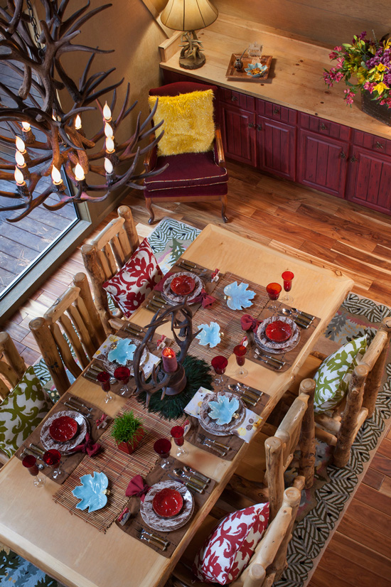
4) Pick something unanticipated. This can be a color, an accessory item or even a small furniture piece. I do love whimsy in design as it keeps spaces from looking too stuffy, just do so in small quantities. In the table setting example, we used an unexpected light blue plate as an accent color and a unique custom fabric for a napkin instead of the traditional fall rust colors. The plates are Faux Bois English China ordered online.
In the library example, we used small cubes made from Kilim rugs and deliberately mismatched them. By doing so, it provides the eye with visual stimulation. A slight variance adds energy to a space. Because these cubes were less than $100 each, as a fall decorative piece, they work.
In closing, have some fun this fall. Think outside the box of a pile of hay and dried stalks from the grocery store and punch your aesthetic up a notch!
|
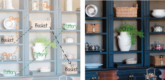 |
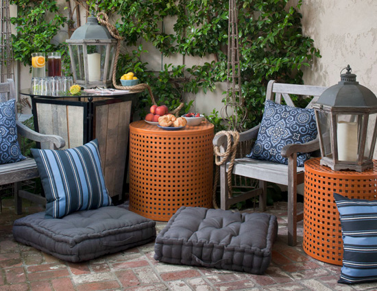
| Here I pulled from the tile which was a color inspiration for the kitchen and we ordered white serveware for the fall, then combined it with silver and natural baskets. Photos Peter Medilek |
 |
| Photo Peter Medilek |
 |
| Ann McDonald, IIDA, NAPO, is the Founder/CEO of Couture Chateau, a luxury interior design firm in Orinda. If you are interested in chatting with us about your holiday décor, we have a few VIP Days still open. Visit http://www.couturechateau.com/vipday or give us a call at (925) 386-0720. |
|
|
| |
|
|
|
|